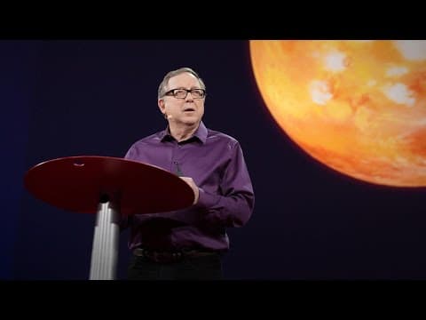
The best stats you've ever seen | Hans Rosling

TL;DR
This talk highlights the need for effective communication of global development data and showcases the power of data visualization in understanding and analyzing the world's changing dynamics.
Transcript
but ten years ago I took on the task to teach global development to Swedish undergraduate students that was after having spent about 20 years together with African institutions studying hunger in Africa so I was sort of expected to know a little about the world and I started in our medical university Karolinska Institute an undergraduate course cal... Read More
Key Insights
- 🚀 Swedish undergraduate students have a statistically significant knowledge gap about the world compared to chimpanzees, indicating the need for improved education and communication of global development issues.
- 🌍 There is significant variation in child mortality rates and fertility rates across different countries, challenging preconceived notions of the Western world versus the third world.
- 💰 The distribution of income worldwide shows a myth of a gap between rich and poor, with a small hump but individuals across the income spectrum.
- 💪 Health improvements are shown to be correlated with economic growth, with countries that prioritize health investment experiencing faster advancements.
- 📊 Data on global development is currently underutilized and hidden in databases, leading to a need for searchable and accessible information for policymakers, entrepreneurs, and the general public.
- 🌐 Internet usage is increasing globally, and its growth aligns closely with countries' GDP per capita, indicating the potential for technology to bridge economic gaps.
- ⚖️ The world is moving towards a more flattened landscape, with countries across the economic spectrum experiencing progress and change at varying rates.
- 🎨 The use of design tools and graphics can help visualize complex data and aid in understanding global development trends effectively.
Install to Summarize YouTube Videos and Get Transcripts
Explore YouTube Video Summarizer or Get YouTube Transcript Extractor
Questions & Answers
Q: Why did the pretest results show that Swedish students knew less about the world than chimpanzees?
The pretest results showed that Swedish students had preconceived ideas about the world based on Western-centric views, which led to their limited knowledge and understanding.
Q: How did the speaker use data visualization to showcase the changes in global development over time?
The speaker used software to display data such as fertility rates, life expectancy, and income distribution in a visually appealing and easy-to-understand format, allowing viewers to see the changes and trends over the years.
Q: What is the significance of making publicly funded data searchable and accessible?
Making publicly funded data searchable and accessible allows students, policymakers, and entrepreneurs to use the data for analysis, decision-making, and innovation, leading to better understanding and progress in global development.
Q: How can data visualization help in understanding complex global issues?
Data visualization simplifies complex global issues by presenting data in a visual format, making it easier to identify patterns, relationships, and trends. This helps in gaining a comprehensive understanding of the issues and aids in finding effective solutions.
Summary
In this video, Professor Hans Rosling discusses his experience teaching global development to Swedish undergraduate students. He shares how he discovered that his students knew statistically significantly less about the world than chimpanzees through a pretest he conducted. He emphasizes the need to communicate data and information about the world, and presents various graphical representations of global development indicators. Professor Rosling also discusses the importance of utilizing publicly funded statistics and making them searchable and accessible to the public.
Questions & Answers
Q: What did Professor Rosling discover through the pretest he conducted with his students?
Through the pretest, Professor Rosling discovered that his Swedish undergraduate students knew statistically significantly less about the world than chimpanzees. Despite having the highest grade in the Swedish college system, they performed poorly in a question about child mortality rates in different countries.
Q: What were the results of the pretest question about child mortality rates?
The pretest question asked which country among five pairs had the highest child mortality rate. The correct answer was Turkey, but the Swedish students only scored 1.8 correct answers out of 5, demonstrating a lack of knowledge about global child mortality.
Q: What was the problem that Professor Rosling identified with his students' understanding of the world?
Professor Rosling realized that the problem was not ignorance among his students, but rather preconceived ideas. They viewed the world in the context of "us" (Western world) and "them" (third world), associating long life with small families (Western world) and short life with large families (third world).
Q: How did Professor Rosling display global health indicators in his teaching?
Professor Rosling used software that displayed each country as a bubble, with the size of the bubble representing the population and the axis representing fertility rate and life expectancy at birth. This visual representation helped students understand the changes in these indicators across different countries and over time.
Q: What did Professor Rosling observe about the changes in fertility rates and life expectancy across different countries?
Professor Rosling observed that, since 1962, industrialized countries had small families and long lives, while developing countries had large families and relatively short lives. However, he also noted that developing countries, such as China and some Latin American countries, were moving towards smaller families and better health.
Q: How did Professor Rosling compare the development of the United States and Vietnam during the Vietnam War?
Professor Rosling compared the development of the United States and Vietnam during the Vietnam War by analyzing changes in their life expectancy and family size. He observed that, despite the war, Vietnam saw improvement in life expectancy as they adopted family planning. Meanwhile, the United States focused on maintaining family size and experienced slower progress.
Q: What did Professor Rosling illustrate about the distribution of income in the world?
Using a graphical representation, Professor Rosling showed that the concept of developing countries and the gap between rich and poor was more nuanced than commonly believed. He portrayed the distribution of income, highlighting that there are wealthy and impoverished individuals across all regions of the world, challenging the perception that aid flows from rich to poor regions.
Q: What did Professor Rosling suggest about utilizing publicly funded statistical data?
Professor Rosling emphasized the need to make publicly funded statistical data searchable and accessible to the public. Currently, much of this data remains hidden in databases and is not effectively utilized. He proposed creating a search function and developing design tools to make the data more comprehensible and usable.
Q: How did Professor Rosling present the relationship between internet usage and GDP per capita?
Professor Rosling showcased the relationship between internet usage and GDP per capita through a graphical representation. He illustrated how this new technology, internet access, correlates with the economy of different countries, suggesting that the world is becoming more interconnected and flattened.
Q: What is the significance of the $100 computer mentioned by Professor Rosling?
Professor Rosling mentions the significance of the $100 computer, highlighting its importance in bridging the digital divide and providing access to information and technology in low-income regions. He suggests that this technology can contribute to lifting countries out of poverty and further drive global development.
Q: What is the broader objective of Professor Rosling's work?
The broader objective of Professor Rosling's work is to promote the effective use of data and information about the world. He aims to communicate this data in an understandable way, challenge preconceived ideas, and encourage public access to publicly funded statistics to facilitate informed decision-making and contribute to global development.
Takeaways
Professor Hans Rosling's presentation emphasizes the need to communicate data and information about the world. His experiences teaching global development to Swedish undergraduate students revealed a lack of knowledge about global health indicators. He utilized graphical representations to display the changes in fertility rates, life expectancy, income distribution, and internet usage across countries. Professor Rosling argues for the importance of making publicly funded statistical data searchable and accessible, and highlights the potential impact of technology, such as the $100 computer, in driving global development. By understanding global trends and challenging preconceived ideas, we can make informed decisions and work towards a more equitable world.
Summary & Key Takeaways
-
The speaker conducted a pretest on Swedish students regarding their knowledge of global development and found that they knew statistically significantly less about the world than chimpanzees.
-
The speaker created software that uses data visualization to display global development data such as fertility rate, life expectancy, and income distribution.
-
The presentation emphasizes the need to make publicly funded data searchable and accessible to students, policymakers, and entrepreneurs, and the power of data visualization in understanding and analyzing complex global issues.
Read in Other Languages (beta)
Share This Summary 📚
Summarize YouTube Videos and Get Video Transcripts with 1-Click
Try YouTube Summary with ChatGPT & Claude or YouTube Transcript Generator
Explore More Summaries from TED 📚


Summarize YouTube Videos and Get Video Transcripts with 1-Click
Try YouTube Summary with ChatGPT & Claude or YouTube Transcript Generator